Friday, April 18, 2014

Making lots of starts.


"Put off finish as it takes a lifetime - wait until later to try to finish things - make a lot of starts." ~Charles Hawthorne
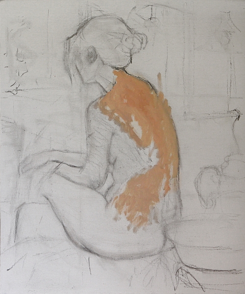
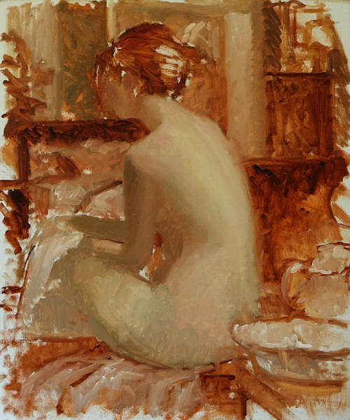
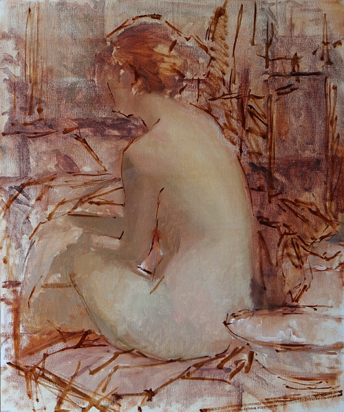
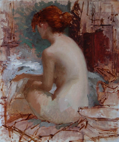
 Demo about simple shapes from my resent  Scottsdale Artists' School workshop.
Many times I don't get very far in my demos during workshops,
as I always encourage dialog between myself and my students.

 ___

One of the main ideas I teach in my workshops is not to be concerned with finishing any of the studies we do. It is in these little studies of the art principles that we as artists learn and grow. By doing these exercises it helps to break us out of habits that we have developed over many years which can cloud our vision.


I thought I would share a resent email I sent to a student interested in taking one of my upcoming workshops.

My response:

First off, I very much appreciate your comments and questions.

When I first set up my curriculum for workshops I decided to approach it from two different directions. The first is to insure that the students understand the basic elements of painting/art via short studies focusing on single elements--example the limited palette. This is by far the best way for artists (including myself) to learn and grow. The second is to allow students more time to work on one piece/pose, so they may take something home that gives them a sense of accomplishment--a more finished piece.

That being said, I have found that the students learn so much more through the shorter studies that I have found myself reducing the time spent on the longer paintings. I have always said, I would rather students take home knowledge than product. This knowledge always finds its way into our work and leads to faster improvement. I do encourage students to take photos of the model as we go, and so when the students get home they can use the studies and the photos in combination to make a larger, more complete painting.

As for the longer pose, I have to be flexible in workshops because of the model's availability. Sometimes we can't get the same model for the entire day. So I approach the longer sessions in one of two ways. Either one long pose on the last day (morning/afternoon)  or splitting the long poses up in two or more afternoon slots. One advantage of this approach is it allows me to teach my methods of working back into a dry painting.

Hope this helps.

Thanks,
Bryce


 Upcoming workshops:

Fredericksburg Artists' School
May 5-9 2014
830.997.0515
http://www.fbgartschool.com/
-
Whidbey Island Fine Art Studio
July 21-25 2014
360.637.4690 / 206.571.0442
http://www.whidbeyislandfas.com/


Sunday, April 13, 2014

Painting Demo at Scottsdale Artist's School

 
Getting a likeness with no features

This is a demo I did during my week long workshop at the Scottsdale Artists' School, April, 2014.

As you can see I didn't get very far, but believe it or not I accomplished my goal. The main principle I wanted to impart was that features are not really what makes a portrait look like a specific person--it's the big shapes. During the week, this study was seen by many people and everyone who saw it knew instantly who the model was.

Students: So think about that the next time you're painting a face. Try to paint it with no features then step back and ask yourself if it looks like the person you're painting. 


 "...If you work on a head for a week
without indicating the features you will have learnt
something about the modeling of the head." --J.S. Sargent


My second goal was to work with temperature to turn the form because there was a very tight value range in the face. Meaning, other than the darks in the eyes and hair and the highlights on the skin there were only two values. So that gave me a lot of room to play with color variations that were in the same value range. Sorry the photo really doesn't show those little variations- it's a bit blurry.

The other major principle I discussed during this demo were edges and how powerful they can be in drawing the viewer's eye to the center of interest.


Monday, February 24, 2014

Upcoming Workshops

~Workshops for 2014~


~Scottsdale Artist School~
March 31st - April 4th

3720 North Marshall Way
Scottsdale, AZ 85251
(480) 990-1422  / (800) 333-5707


http://www.scottsdaleartschool.org/

~Sign up page~
- 

~Fredericksburg Artists' School~
May 5-9 2014
503 E. Schubert 


Fredericksburg, Texas 78624
830.997.0515

http://www.fbgartschool.com/ 

-
~Whidbey Island Fine Art Studio~
July 21-25 2014

813 Edgecliff Drive
Langley, Washington 98260
360.637.4690 / 206.571.0442
 

http://www.whidbeyislandfas.com/
-
~Course Gallery and Atelier~
October 10th - 13th  2014

4144 Herschel St.
Jacksonville, FL 32210
(904) 388-8205
Toll Free (877) 386-8205
 

http://www.corsegalleryatelier.com/

Wednesday, February 12, 2014

Materials and Components: Flake White- a little knowledge goes a long way?


Is painting with lead white worth it?  Is it so dangerous that we artists shouldn't use it?


I often hear students and artists propagating exaggerated and untrue information about this indispensable pigment. I feel compelled to clarify some of the misconceptions and even paranoia about one of the greatest pigments for artists of all time! With just a few simple precautions everyone can learn to enjoy the unique properties of lead white.

Before we begin, let me ask you a question.
Do you think Sargent used titanium white to paint this sumptuous portrait?

How about Rembrandt?

Bouguereau?

Sorolla?

How about Waterhouse?
  The answer to all of the above is NO!

They used flake white, cremnitz white or perhaps flemish white.Yes folks, those are all lead whites.
 Let me throw out a few other names that used lead white as their white: Velasquez, Vermeer,  Rubens, Titan, Caravaggio, Reynolds, Repin, Courbet, Zorn, Fechin, Inness...the list is endless. In fact lead white has been used for thousands of years and its history goes back to ancient Greece and Rome. 

Now don't get me wrong, titanium white is a fantastic pigment, and is a perfectly good white to use for many artists in many situations. I simply want to point out some of the unique properties of lead white.

Note: In this article I will just use the generic term lead white to describe artist pigments such as flake white, cremnitz white, flemish white and a few other not so common names. The base pigment used in all these paints is either basic lead carbonate PW1 or lead sulfide PW3 (in flemish white). Typically cremnitz white is PW1, and flake white is PW1 mixed with some PW4(zinc oxide).  I've noticed companies will change that around sometimes and in some cases will even add titanium PW6 to their flake white. I'm sorry it has to be so confusing.

Second Note: Most titanium whites are mixed with PW4 (zinc oxide). In my opinion this is the only usable titanium. Titanium by itself is best used for painting your house.

_____________________________


 First off let me talk about the handling properties of lead white vs titanium white. 

 1-Titanium white is a very strong white with a high tinting strength.Coupled with its opaqueness it can over take many of the other colors you have on your palette. For example, have you ever painted a face (or other objects for that matter) and stepped back to realize it's all too chalky? What happened? Well, there are many reasons for this but the overpowering strength and opaqueness of titanium white cannot be over- looked.

2-Lead white, on the other hand, is semi-opaque and the pigment tinting strength is lower. In fact, because of the lower tinting strength you don't have to use as much of your other colors for your mixtures, especially those very expensive cadmiums and cobalts. When using lead white I find it much easier to change the color temperatures in my paint mixtures without changing the values. I also find it easier to bulk up my paint layers simply because I'm using more of the lead white in my mixtures.

3-Lead white is a warmer white than titanium. This warm softness of tone lends itself beautifully to painting flesh tones. It also has a soft creamy, yet stiff consistency which I love. It's sorta like painting with butter and it retains brush strokes easily. Works great for those impasto areas.

Note: I need to point out that flemish white PW3 has a different handling characteristic to flake PW1,PW4 or cremnitz white PW1, in that it has a long ropey consistency (kind of stringy) and has a leveling effect, meaning your brush strokes will tend to level off and lose their brush marks. It takes a little getting use to.

 4- Lead white dries faster than titanium, which might be a good characteristic for you plein air painters. 

5- Lead white has a lower oil absorption than titanium white. Which means it takes less oil to make it into an oil paint. This makes it a fantastic paint for anyone doing layers or under-painting. It fits the fat over lean rule of painting.


 ________

 Now let me address the toxic aspects of the lead pigments. First off I want to point out there are really only three ways that lead might be introduced into your system as an artist.

1. Inhalation (you breathe it in)
2. Skin absorption
3. Through your mouth, tongue, eyes and nose.

1. Inhalation: lead white is in it's most dangerous state as a dry pigment. It becomes easily inhaled into the lungs and introduced directly into the blood stream. Bad! But let me ask all the artists out there, do you use lead white dry pigment? Some do, but the vast majority do not. We use it in a premixed tube of paint. One other way it might be inhaled is through sanding. That is, sanding down the surface of your dry painting. But regardless of what pigments you've used, it would make sense to take all precautions available when doing this. There are several pigments I wouldn't want to inhale such as all the cadmiums, cobalts, cerulean and a few others. So lead white is no different.

2. Absorption through the skin: This is not generally true. The lead pigment particle is actually quite large and is not readily able to be absorbed directly through healthy skin. However, If you have open sores and cracks on your hands it would allow the particles to get down through your skin. Again, Bad! But a simple solution for that is to wear gloves. Besides, gloves aren't a bad idea in general, I use them just to make clean up easier.

3. In through your mouth, eyes and nose: Okay, my rule-- DON'T eat while painting. Don't smoke while painting, (well there's a myriad of unhealthy things going on there, maybe just don't smoke PERIOD!). And basically just be aware of where your hands and your brushes are going. I mean not in your mouth! Just simply keep your face out of the painting process. Not too hard right?! Nicoli Fechin's liberal use of his saliva in his paint led to lead poisoning and I believe it killed him. This is also the primary cause of children getting lead poisoning from flaking exterior paint on old buildings. The old (apparently sweet tasting)dry paint flakes off and falls in the soil. The children play in the dirt and as all children do, they put the dirt and things that have been in the dirt, in their mouths. Voila--lead poisoning. And we all know young children are particularly susceptible to the effects of lead. Anyway I digress. After you're done painting,  simply wash your hands. Then go get that snack you've been craving.

___________________


So bottom line, yes it is toxic, but I really think a little knowledge goes a long way and always supersedes any form of ignorance or paranoia. As a painter it's your responsibility to know about all of the components you're using and how they work together. Being a painter means you're also a chemist! Always look to see what pigments are in your tubes of paint regardless of the color. If they don't state what they're made of, don't buy them. 

I highly recommend a book every artists should have at his/her disposal:
The Painters Handbook by Mark David Gottsegan 

There is just so much to discuss about white that I couldn't get to all of it here. But remember, white is the most important color we artists use. It goes into nearly every mixture we make.
_____

I've included a few links below to companies that still make lead white. I believe all the major art paint manufacturers have stopped production entirely.

Michael Harding

This site is a great resource regarding pigments and their corresponding chemical names.

Color of Art Pigment Database


If you'd like to know more about lead white, I discuss it in more depth in my workshops. And remember if we, as artists, allow lead white to be villianized,  are cadmiums next? How about cobalts or cerulean? In all of these cases there is no suitable replacement. We are allowing our hands to be tied.

My Upcoming Workshops:


Thursday, July 11, 2013

My Perseptions #3 The Limited Palette


 16 x 12- 2 hour study from life--Limited palette.

 Colors used:
Titanium white -Utrecht
Yellow ochre - Rembrandt
cad red medium - Rembrandt
Ivory black - Gamblin 

It's back! Yes it's the old limited palette.

In my workshops we spend a lot of time working with the limited palette. Not just these particular colors.

Again I want to stress it's about relationships, everything is relative to each other. Sure the green you get is pretty dull but so is the violet. When you get them working next to each other, they really stand out. It's a bit like the old saying you dont get lights without darks.


"A sketch has charm because of its truth – not because it is unfinished." 
-Charles Hawthorne


Tuesday, June 11, 2013

The Good, the Bad and the Ugly #2


 Referring to my sketches of course, not the models: They're full of mistakes--but hey, they are what they are!!
__


9 x 6 life study- 30 min. This was an interesting little study. It's sorta free form, that is, I did no pre-drawing and really just turned off my brain. I remember feeling relaxed when I walked into the open drawing session. I really had no expectations whatsoever. No pressure is always a good thing!

10 x 8 life sketch- 1 1/2hr. I wanted to experiment with atmosphere with this little study. I used a palette knife to keep pulling the paint layers down. I would then repaint certain areas. This is a more indirect approach to painting. Many times you have to go backwards before you can go forward.


16 x 12 (sketch from photo reference) 1 1/2hrs. I did this little study on a day where I scraped off the painting I was working on for one of my galleries. And instead of leaving the studio in shame, I decided to pull out an old photo and play around.  I was quite pleased how this one came out.


Great patience is called for on the hard path that I have entered on. 
-Edgar Degas


Wednesday, May 29, 2013

My Perseptions #2 Form, Edge and Shape


Personal thoughts about a painting fresh off my easel.


Lotus 16 x 20 Oil on Linen


This is not a step by step instructional post, but rather an attempt to put into words some of the thoughts going through my head as I worked on this painting.

My full palette:
ivory black, raw umber, transparent oxide red, Sevres blue, ultramarine blue, dark cool red* , cad red light, cad orange, cad yellow lt. titanium/zinc white.

*my deep cool red is made up of two colors -quinacridone violet, peylene red.

___

 I need to make one disclaimer here before I go on: in this image of the painting (as with all my images) I don't feel the camera captured the subtle changes of temperature and values of the flesh and I always find my images have too much contrast. Even though I'm pretty versed in image manipulation, the images never portray the beautiful subtitles of the original painting. But that's why we buy original art right!?:-)

OK, so now I have that off my chest, let's move on. When the model struck this pose I knew I had something. I love the simple lines, the simple overall shape.  I enjoy the separation between the lights and the shadows. Notice the warm reflection bouncing up from the upper thigh onto the ribcage. The pose really seemed to me to have a lot of emotion and more than enough beauty.

I found the drawing aspect to be easier than most--no hands, no face. But I must say that drawing is always a challenge for me. But it's really just a circle--right? That's what I based it on and then just divided up the big shapes. My next challenge was to turn the form across the back and get a feeling of the light falling down upon the figure. I subdued the light on the lower leg and brought up the highlight on the hip--which is the center of interest.

Currently edge is one of the elements of art that I want to take to the next level. So I had some fun letting go and scraping down and blurring the edges. It seemed to help set the figure into the surrounding environment properly. Atmosphere is the other element that I'm working on extra hard these days--we'll save that for another post.

To finish off the painting I ran out to my lily pond to pick some lotus blossoms...no just kidding I dont have a lily pond. Okay I confess they're just some silk ones I have in the studio.

The whole painting took almost 3 days to complete using a life model and finishing it from photos.

____

Remember to pay close attention to any object’s inherent shape and try to keep it simple. Think circles, rectangles and triangles. Also, try not to think of what a specific object is, instead think, “What shape is it?” Remember, shapes play an extremely important role when it comes to working with the figure. An arm is not an arm, but a cylinder. Finally, be sure to give shapes a little variety and at the same time pay attention to the negative spaces—which are shapes too.


"If the artist sees nothing within him, then he should also refrain from painting what he sees before him."
-Caspar David Friedrich


Monday, December 10, 2012

Perseptions

Perceptions
on 
Color relevancy and the limited palette

 2 hour study from life--Limited palette.

 Colors used:
Titanium white -Utrecht
Yellow ochre - Rembrandt
ced red medium - Rembrandt
Ivory black - Gamblin 

I find December a great time to step back and rethink a few things. The first order of business was to scrape down my palette. I wanted to reset my thinking on color. So I decided to give the "Zorn" colors a try again. I have worked with this set of colors at different times over the past ten years. So I was excited to give 'em a try again. 

When you have the model in front of you and the clock is ticking, there's a lot going through your mind. One of your comfort zones is to grab for your "typical colors" the ones you're use to and start mixing. But what happens when they're not there...and the clock is ticking! You have to rethink everything and fast! 

But just relax and remember, values are king, so dont throw the baby out with the bath water here. And just keep thinking and observing warm and cool...and of course don't forget to squint. Simple right? It's simpler than you think and exciting. Don't think about trying to get "that" color you see. Instead ask yourself what temperature and value is that color relative to everything around it, and mix according to that rule. You'll be surprised by what you can do with so little. I'll stick with this limited palette for a while, I really enjoyed it.

So next time you paint, give it a try and let me know how it goes.

Final thought--it's all about relevancy.

"Only when he no longer knows what he is doing does the painter do good things." --Edgar Degas


Wednesday, November 14, 2012

The good, the bad and the ugly #1

I call them- The good, the bad and the ugly. Referring to my sketches of course, not the models. They're full of mistakes--but hey, they are what they are!!!
________


 15 minute- On gessoed drawing paper- 7x10. Focus: I wasn't too concerned with proper proportion or detail, I was only after the gesture. Surprising how the eye can fill in the missing parts.


10 to 15 min- Hahnemuhle drawing paper coated with acrylic medium to seal the paper from the oil- each is 7x5. Focus: These are fast and fun to do. You only have time to get the basic shapes--dont forget to squint!


 1 hour- On Centurion linen- 10x8. Focus: I was after shapes and proportions without an preliminary drawing. Train you eye to see proper shapes.


1 hour- On gessoed drawing paper- 10x 6 Focus: I simply wanted to see how far I could push color. Values are the foundation for the structure.


 1 hour- On gessoed drawing paper- 14x11. Focus: With this quick portrait I was after a tonal feel, so I limited the color and kept the paint thin.


 45 min- On Centurion linen- 8x10. Focus: I was after the simple separation of light and shadow. I had some fun putting down very thick paint on the light side.


 45 min- On Centurion linen- 8x10. Focus: Sometimes we just dont have time to finish--it is what it is..no see, no hear:-)


Wednesday, October 17, 2012

Step by Step of Essence of Lavender 30 x 24 Oil on Linen


Palette colors
 The palette that you see on the right is out of my travel box. Many times instead of squeezing color out on my studio taboret, I just clamp this palette down, and can use both surfaces to mix color.

 So from left to right:
Raw umber, transparent oxide red, Sevres, blue, ultramarine blue, quinacridone violet, peylene red, cad red light, cad yellow dp, cad yellow lt. titanium/zinc white.

It's my basic double primary palette, with a Quinacridone violet and a warm and a cool brown thrown in.
The two blobs of color to the left are just palette scrapings left over from the previous day.


 Step 1:
For many of my paintings, particularly undraped figures, I will do a separate drawing that I can refer back to. But in this case I started the charcoal drawing directly on the white ground of the linen. After many changes of both placement and proportions I ended up with this drawing…it’s certainly nothing fancy. I start with the paint by applying color to the light side of the figure using a mixture of white, cad yellow lt. and perylene red with a small amount of sevres blue (sevres blue is a Rembrandt color which is thalo blue and white). I want to keep the paint thin at this stage, so I use a generous amount of OMS to thin the mixtures.


 Step 2:
I continue to apply the basic flesh tones over most of the figure. I also mass in the general tones of the background, keeping them toward the warmer side and not pushing the values too far light or dark. As I work into the darker flesh tones I add some transparent earth red to the mixture. I’m paying particular attention to the grouping of the overall tones, trying to keep similar tones massed together, so at this stage I can get a feeling of where the painting is going.


 Step 3:
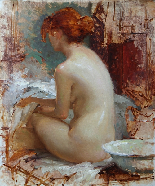
“Wow what was I thinking?!” was my first thought the next day. I was still happy with the figure but I felt that my background was too broken up and didn’t seem to make the best design. My tones weren’t as grouped as I had thought they were. I didn’t really want to scrape the panting down, but that little annoying voice kept telling me that I’d be sorry if I didn’t. With some trepidation, I went for it, scraping and wiping down most of the surface, fortunately the painting was still a little wet from the previous day, so the paint came off easily. I then proceeded to change the elements in the background, focusing on simplifying the design. With a few changes of furniture I was able to facilitate a simpler triangular design that focused more strongly on the figure. I then reestablished the figure along with the new changes in the background. The changes took most of day but it was definitely worth it.


 Step 4 and 5:
The next day I started working in earnest on the flesh tones. The figure is being lit with a cool north light, so I add sevres blue and quinacridone violet to the basic mixture of  yellow, red and white to give the flesh a cool tone on the light side. On the shadow side I keep my mixtures warmer by adding transparent red and cad. red light to the mixture. I’m not thinning the paint much. I enjoy putting the paint down thickly on the light side and a little thinner on the shadow side, that way there is more interest in the paint layers. As I apply the paint, I want to just put it down and not move it around too much. I will do some blending with my fingers.


Step 5: (Continuation of step 4):
You can see the flesh has taken on some fun color change-ups. It has taken me all day to work this stage.


Step 6:
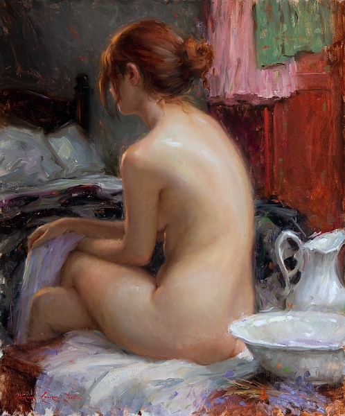
This is the finished painting. I know it made a big jump to this stage. I got so into the painting I forgot to shoot it along the way--sorry. This stage represents two days work, but really all I did was to continue to resolve the flesh tones and shapes and give the edges some variety. I work all around the painting, trying not to spend too much time on any one spot. At some point during these last days I decided to move the bedspread and reduce the white sheet. It helped to get the dark against her shadow side so that the values didn’t jump too much; it added a solid feeling to the left side of the painting. 

Black & white and reduced value illustrations:

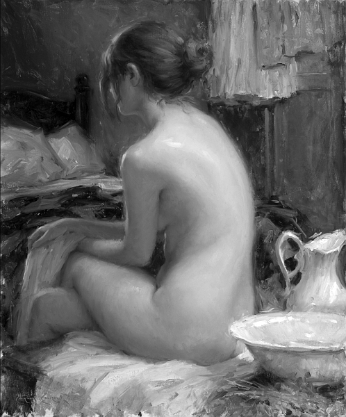
I like to show my painting in black & white to illustrate the organization of the shapes and value masses. I used a lot of color in the painting, but look at it in black & white, it seems very tonal—I think it reads quite well.
 
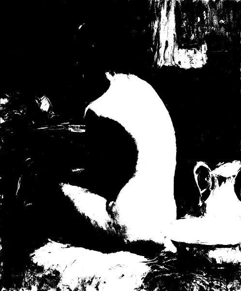
Now let’s look at it in two values. I used Photoshop to reduce the image down to two values only, notice the grouping of shapes. It makes for some abstract shapes (there is no face), but I feel it is well balanced.


Here it is in 3 values. It takes on more reality, it looks like a person. I think it is important how the middle values hold the painting together.


That's it, Thanks for looking.