
Step by Step of Essence of Lavender 30 x 24 Oil on Linen
Palette colors:
The palette that you see on the right is out of my travel box. Many times instead of squeezing color out on my studio taboret, I just clamp this palette down, and can use both surfaces to mix color.
So from left to right:
Raw umber, transparent oxide red, Sevres, blue, ultramarine blue, quinacridone violet, peylene red, cad red
light, cad yellow dp, cad yellow lt. titanium/zinc white.
It's my basic double primary palette, with a Quinacridone violet and a warm and a cool brown thrown in.
The two blobs of color to the left are just palette scrapings left over from the previous day.
The two blobs of color to the left are just palette scrapings left over from the previous day.

 |
|
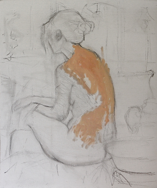
Step 1:
For many of my paintings, particularly undraped figures, I
will do a separate drawing that I can refer back to. But in this case I started
the charcoal drawing directly on the white ground of the linen. After many
changes of both placement and proportions I ended up with this drawing…it’s
certainly nothing fancy. I start with the paint by applying color to the light
side of the figure using a mixture of white, cad yellow lt. and perylene red with
a small amount of sevres blue (sevres blue is a Rembrandt color which is thalo
blue and white). I want to keep the paint thin at this stage, so I use a
generous amount of OMS to thin the mixtures.
|
 |
|
Step 2:
I continue to apply the basic flesh tones over most of the
figure. I also mass in the general tones of the background, keeping them toward
the warmer side and not pushing the values too far light or dark. As I work
into the darker flesh tones I add some transparent earth red to the mixture. I’m
paying particular attention to the grouping of the overall tones, trying to
keep similar tones massed together, so at this stage I can get a feeling of
where the painting is going.
|
 |
|
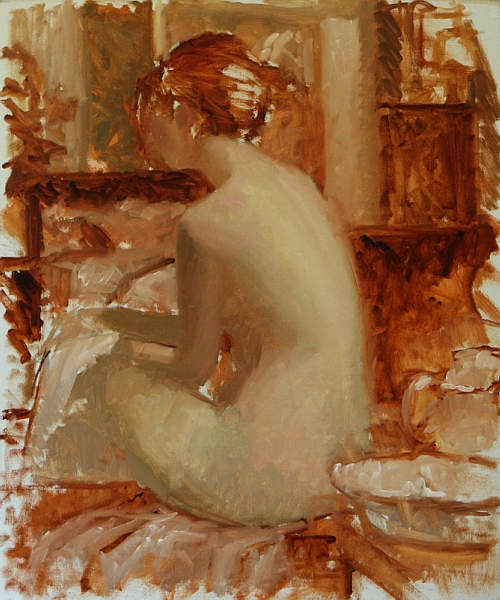
Step 3:
“Wow what was I thinking?!” was my first thought the next
day. I was still happy with the figure but I felt that my background was too
broken up and didn’t seem to make the best design. My tones weren’t as grouped
as I had thought they were. I didn’t really want to scrape the panting down,
but that little annoying voice kept telling me that I’d be sorry if I didn’t.
With some trepidation, I went for it, scraping and wiping down most of the
surface, fortunately the painting was still a little wet from the previous day,
so the paint came off easily. I then proceeded to change the elements in the
background, focusing on simplifying the design. With a few changes of furniture
I was able to facilitate a simpler triangular design that focused more strongly
on the figure. I then reestablished the figure along with the new changes in
the background. The changes took most of day but it was definitely worth it.
|
 |
|
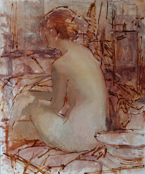
Step 4 and 5:
The next day I started working in earnest on the flesh
tones. The figure is being lit with a cool north light, so I add sevres blue
and quinacridone violet to the basic mixture of yellow, red and white to give the flesh a cool
tone on the light side. On the shadow side I keep my mixtures warmer by adding
transparent red and cad. red light to the mixture. I’m not thinning the paint
much. I enjoy putting the paint down thickly on the light side and a little
thinner on the shadow side, that way there is more interest in the paint
layers. As I apply the paint, I want to just put it down and not move it around
too much. I will do some blending with my fingers. |
 |
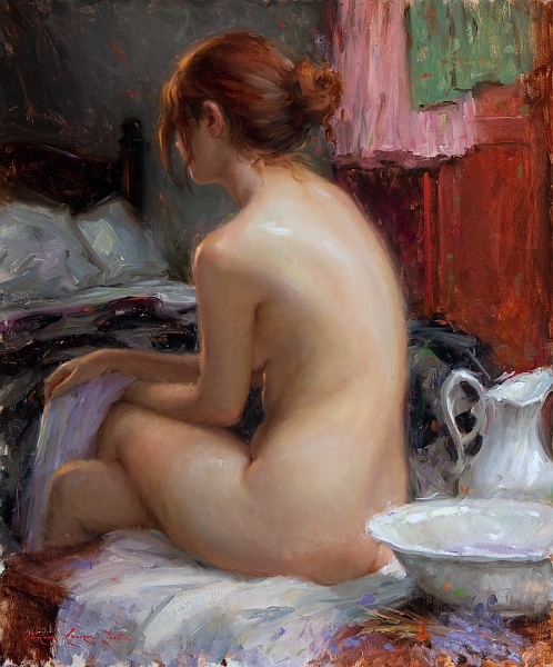
| Step 5: (Continuation of step 4): You can see the flesh has taken on some fun color change-ups. It has taken me all day to work this stage. |
 |
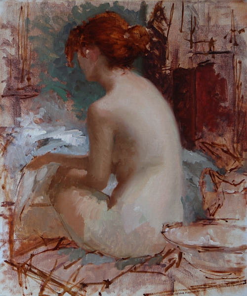
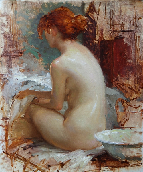
Step 6:
This is the finished painting. I know it made a big jump to
this stage. I got so into the painting I forgot to shoot it along the way--sorry.
This stage represents two days work, but really all I did was to continue to
resolve the flesh tones and shapes and give the edges some variety. I work all
around the painting, trying not to spend too much time on any one spot. At some
point during these last days I decided to move the bedspread and reduce the
white sheet. It helped to get the dark against her shadow side so that the
values didn’t jump too much; it added a solid feeling to the left side of the
painting.
|
Black & white and
reduced value illustrations:
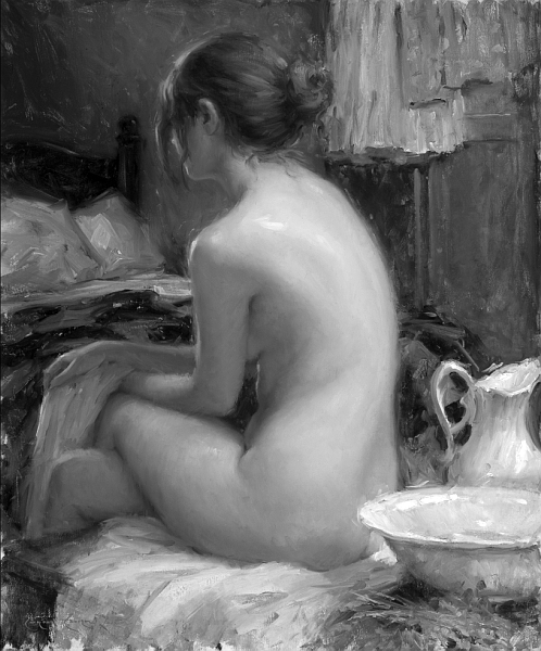 |
| I like to show my painting in black & white to illustrate the organization of the shapes and value masses. I used a lot of color in the painting, but look at it in black & white, it seems very tonal—I think it reads quite well. |
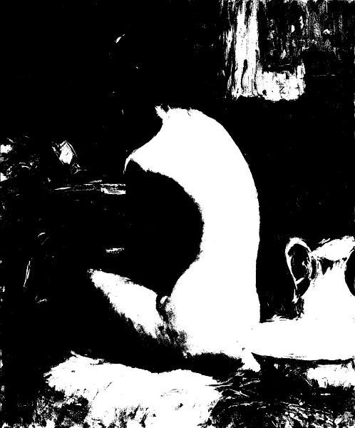 |
| Now let’s look at it in two values. I used
Photoshop to reduce the image down to two values only, notice the grouping of
shapes. It makes for some abstract shapes (there is no face), but I feel it is
well balanced. |
 |
|
Here it is in 3 values. It takes on more reality, it looks
like a person. I think it is important how the middle values hold the painting
together.
That's it, Thanks for looking.
|