Thursday, July 11, 2013

My Perseptions #3 The Limited Palette


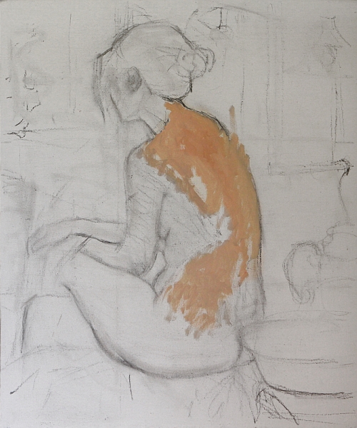
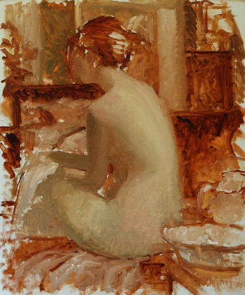
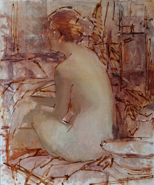
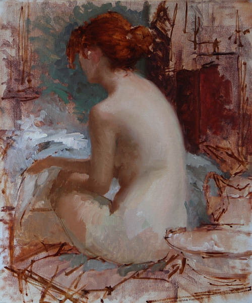
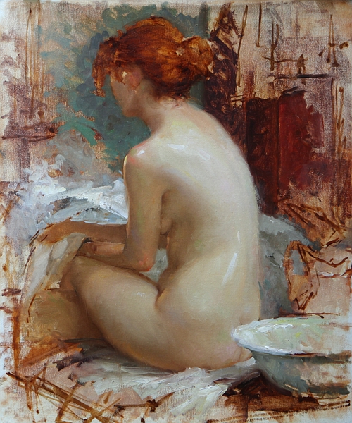
 16 x 12- 2 hour study from life--Limited palette.

 Colors used:
Titanium white -Utrecht
Yellow ochre - Rembrandt
cad red medium - Rembrandt
Ivory black - Gamblin 

It's back! Yes it's the old limited palette.

In my workshops we spend a lot of time working with the limited palette. Not just these particular colors.

Again I want to stress it's about relationships, everything is relative to each other. Sure the green you get is pretty dull but so is the violet. When you get them working next to each other, they really stand out. It's a bit like the old saying you dont get lights without darks.


"A sketch has charm because of its truth – not because it is unfinished." 
-Charles Hawthorne


Tuesday, June 11, 2013

The Good, the Bad and the Ugly #2


 Referring to my sketches of course, not the models: They're full of mistakes--but hey, they are what they are!!
__


9 x 6 life study- 30 min. This was an interesting little study. It's sorta free form, that is, I did no pre-drawing and really just turned off my brain. I remember feeling relaxed when I walked into the open drawing session. I really had no expectations whatsoever. No pressure is always a good thing!

10 x 8 life sketch- 1 1/2hr. I wanted to experiment with atmosphere with this little study. I used a palette knife to keep pulling the paint layers down. I would then repaint certain areas. This is a more indirect approach to painting. Many times you have to go backwards before you can go forward.


16 x 12 (sketch from photo reference) 1 1/2hrs. I did this little study on a day where I scraped off the painting I was working on for one of my galleries. And instead of leaving the studio in shame, I decided to pull out an old photo and play around.  I was quite pleased how this one came out.


Great patience is called for on the hard path that I have entered on. 
-Edgar Degas


Wednesday, May 29, 2013

My Perseptions #2 Form, Edge and Shape


Personal thoughts about a painting fresh off my easel.


Lotus 16 x 20 Oil on Linen


This is not a step by step instructional post, but rather an attempt to put into words some of the thoughts going through my head as I worked on this painting.

My full palette:
ivory black, raw umber, transparent oxide red, Sevres blue, ultramarine blue, dark cool red* , cad red light, cad orange, cad yellow lt. titanium/zinc white.

*my deep cool red is made up of two colors -quinacridone violet, peylene red.

___

 I need to make one disclaimer here before I go on: in this image of the painting (as with all my images) I don't feel the camera captured the subtle changes of temperature and values of the flesh and I always find my images have too much contrast. Even though I'm pretty versed in image manipulation, the images never portray the beautiful subtitles of the original painting. But that's why we buy original art right!?:-)

OK, so now I have that off my chest, let's move on. When the model struck this pose I knew I had something. I love the simple lines, the simple overall shape.  I enjoy the separation between the lights and the shadows. Notice the warm reflection bouncing up from the upper thigh onto the ribcage. The pose really seemed to me to have a lot of emotion and more than enough beauty.

I found the drawing aspect to be easier than most--no hands, no face. But I must say that drawing is always a challenge for me. But it's really just a circle--right? That's what I based it on and then just divided up the big shapes. My next challenge was to turn the form across the back and get a feeling of the light falling down upon the figure. I subdued the light on the lower leg and brought up the highlight on the hip--which is the center of interest.

Currently edge is one of the elements of art that I want to take to the next level. So I had some fun letting go and scraping down and blurring the edges. It seemed to help set the figure into the surrounding environment properly. Atmosphere is the other element that I'm working on extra hard these days--we'll save that for another post.

To finish off the painting I ran out to my lily pond to pick some lotus blossoms...no just kidding I dont have a lily pond. Okay I confess they're just some silk ones I have in the studio.

The whole painting took almost 3 days to complete using a life model and finishing it from photos.

____

Remember to pay close attention to any object’s inherent shape and try to keep it simple. Think circles, rectangles and triangles. Also, try not to think of what a specific object is, instead think, “What shape is it?” Remember, shapes play an extremely important role when it comes to working with the figure. An arm is not an arm, but a cylinder. Finally, be sure to give shapes a little variety and at the same time pay attention to the negative spaces—which are shapes too.


"If the artist sees nothing within him, then he should also refrain from painting what he sees before him."
-Caspar David Friedrich


Monday, December 10, 2012

Perseptions

Perceptions
on 
Color relevancy and the limited palette

 2 hour study from life--Limited palette.

 Colors used:
Titanium white -Utrecht
Yellow ochre - Rembrandt
ced red medium - Rembrandt
Ivory black - Gamblin 

I find December a great time to step back and rethink a few things. The first order of business was to scrape down my palette. I wanted to reset my thinking on color. So I decided to give the "Zorn" colors a try again. I have worked with this set of colors at different times over the past ten years. So I was excited to give 'em a try again. 

When you have the model in front of you and the clock is ticking, there's a lot going through your mind. One of your comfort zones is to grab for your "typical colors" the ones you're use to and start mixing. But what happens when they're not there...and the clock is ticking! You have to rethink everything and fast! 

But just relax and remember, values are king, so dont throw the baby out with the bath water here. And just keep thinking and observing warm and cool...and of course don't forget to squint. Simple right? It's simpler than you think and exciting. Don't think about trying to get "that" color you see. Instead ask yourself what temperature and value is that color relative to everything around it, and mix according to that rule. You'll be surprised by what you can do with so little. I'll stick with this limited palette for a while, I really enjoyed it.

So next time you paint, give it a try and let me know how it goes.

Final thought--it's all about relevancy.

"Only when he no longer knows what he is doing does the painter do good things." --Edgar Degas


Wednesday, November 14, 2012

The good, the bad and the ugly #1

I call them- The good, the bad and the ugly. Referring to my sketches of course, not the models. They're full of mistakes--but hey, they are what they are!!!
________


 15 minute- On gessoed drawing paper- 7x10. Focus: I wasn't too concerned with proper proportion or detail, I was only after the gesture. Surprising how the eye can fill in the missing parts.


10 to 15 min- Hahnemuhle drawing paper coated with acrylic medium to seal the paper from the oil- each is 7x5. Focus: These are fast and fun to do. You only have time to get the basic shapes--dont forget to squint!


 1 hour- On Centurion linen- 10x8. Focus: I was after shapes and proportions without an preliminary drawing. Train you eye to see proper shapes.


1 hour- On gessoed drawing paper- 10x 6 Focus: I simply wanted to see how far I could push color. Values are the foundation for the structure.


 1 hour- On gessoed drawing paper- 14x11. Focus: With this quick portrait I was after a tonal feel, so I limited the color and kept the paint thin.


 45 min- On Centurion linen- 8x10. Focus: I was after the simple separation of light and shadow. I had some fun putting down very thick paint on the light side.


 45 min- On Centurion linen- 8x10. Focus: Sometimes we just dont have time to finish--it is what it is..no see, no hear:-)


Wednesday, October 17, 2012

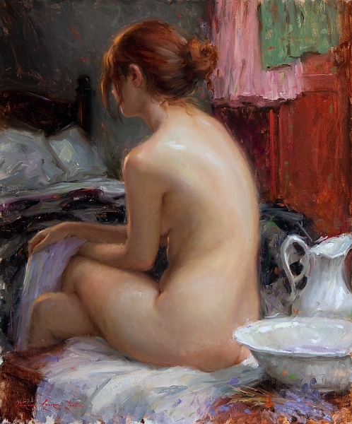
Step by Step of Essence of Lavender 30 x 24 Oil on Linen


Palette colors
 The palette that you see on the right is out of my travel box. Many times instead of squeezing color out on my studio taboret, I just clamp this palette down, and can use both surfaces to mix color.

 So from left to right:
Raw umber, transparent oxide red, Sevres, blue, ultramarine blue, quinacridone violet, peylene red, cad red light, cad yellow dp, cad yellow lt. titanium/zinc white.

It's my basic double primary palette, with a Quinacridone violet and a warm and a cool brown thrown in.
The two blobs of color to the left are just palette scrapings left over from the previous day.


 Step 1:
For many of my paintings, particularly undraped figures, I will do a separate drawing that I can refer back to. But in this case I started the charcoal drawing directly on the white ground of the linen. After many changes of both placement and proportions I ended up with this drawing…it’s certainly nothing fancy. I start with the paint by applying color to the light side of the figure using a mixture of white, cad yellow lt. and perylene red with a small amount of sevres blue (sevres blue is a Rembrandt color which is thalo blue and white). I want to keep the paint thin at this stage, so I use a generous amount of OMS to thin the mixtures.


 Step 2:
I continue to apply the basic flesh tones over most of the figure. I also mass in the general tones of the background, keeping them toward the warmer side and not pushing the values too far light or dark. As I work into the darker flesh tones I add some transparent earth red to the mixture. I’m paying particular attention to the grouping of the overall tones, trying to keep similar tones massed together, so at this stage I can get a feeling of where the painting is going.


 Step 3:
“Wow what was I thinking?!” was my first thought the next day. I was still happy with the figure but I felt that my background was too broken up and didn’t seem to make the best design. My tones weren’t as grouped as I had thought they were. I didn’t really want to scrape the panting down, but that little annoying voice kept telling me that I’d be sorry if I didn’t. With some trepidation, I went for it, scraping and wiping down most of the surface, fortunately the painting was still a little wet from the previous day, so the paint came off easily. I then proceeded to change the elements in the background, focusing on simplifying the design. With a few changes of furniture I was able to facilitate a simpler triangular design that focused more strongly on the figure. I then reestablished the figure along with the new changes in the background. The changes took most of day but it was definitely worth it.


 Step 4 and 5:
The next day I started working in earnest on the flesh tones. The figure is being lit with a cool north light, so I add sevres blue and quinacridone violet to the basic mixture of  yellow, red and white to give the flesh a cool tone on the light side. On the shadow side I keep my mixtures warmer by adding transparent red and cad. red light to the mixture. I’m not thinning the paint much. I enjoy putting the paint down thickly on the light side and a little thinner on the shadow side, that way there is more interest in the paint layers. As I apply the paint, I want to just put it down and not move it around too much. I will do some blending with my fingers.


Step 5: (Continuation of step 4):
You can see the flesh has taken on some fun color change-ups. It has taken me all day to work this stage.


Step 6:
This is the finished painting. I know it made a big jump to this stage. I got so into the painting I forgot to shoot it along the way--sorry. This stage represents two days work, but really all I did was to continue to resolve the flesh tones and shapes and give the edges some variety. I work all around the painting, trying not to spend too much time on any one spot. At some point during these last days I decided to move the bedspread and reduce the white sheet. It helped to get the dark against her shadow side so that the values didn’t jump too much; it added a solid feeling to the left side of the painting. 

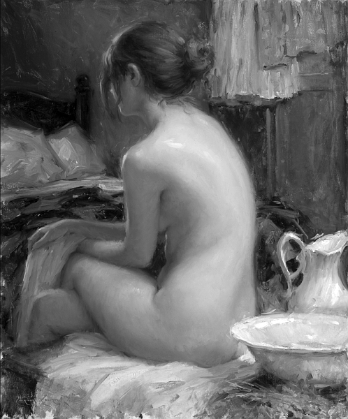
Black & white and reduced value illustrations:

I like to show my painting in black & white to illustrate the organization of the shapes and value masses. I used a lot of color in the painting, but look at it in black & white, it seems very tonal—I think it reads quite well.
 
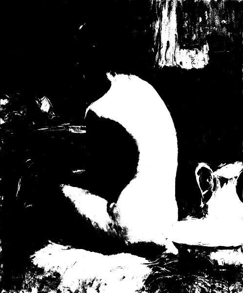
Now let’s look at it in two values. I used Photoshop to reduce the image down to two values only, notice the grouping of shapes. It makes for some abstract shapes (there is no face), but I feel it is well balanced.


Here it is in 3 values. It takes on more reality, it looks like a person. I think it is important how the middle values hold the painting together.


That's it, Thanks for looking. 


Sunday, October 30, 2011

Three Sketches -3 hour session

Here are three fairly resent oil sketches from life, 12x16. Full of mistakes and wish ida's but I guess that's why they call them sketches. In each one of them I tried to focus on design, gesture and basic anatomy. I tried to keep things simple. --Bryce


Monday, October 24, 2011

My first iPad sketch done with ArtRage

Note: I started my blog many months ago hoping to help students understand how I work and the thought processes behind my work. I haven't posted anything on the blog since I started, so I must apologize. It can be very difficult for me to extract my thoughts and get them down on paper, when I sit down to actually write out my thoughts, they just seem to vanish. I guess that's why I'm a visual artist and not a writer. But, starting today, I'm going to make a concerted effort to write an entry into this blog each week. 
_________________

This is a 2 hour portrait sketch I did on my new iPad using a program called ArtRage. This is a totally new medium for me. Having never done anything electronically before, I find it's a great way to do a study in a very short amount of time. This portrait, which was done from life, looks very much like the model, with the exception of the mouth. There’s something a bit off with it…oh well, it’s a study right. As Sargent said "A portrait is a painting with something wrong with the mouth".  In using this medium I find it very difficult to blend colors and their respective values into each other. I think a little more “easel” time will help. But what I like about the iPad is the flexibility that it has. I mean it has an undo button!!! What more could you ask for?:-) Working on the iPad gives you room to experiment. You don't have to be afraid to make mistakes because if you do, you simply hit undo or save as. Feel free to experiment!

I’ll post more iPad sketches as I go forward, and we’ll see if I get any better. I need to get outside with the iPad and Artrage to get some plein air sketches


Sunday, February 6, 2011

My First Post

Time to join the 21st Century I guess

My plan is to add instructional information and step by step images.

But for this first post I'll just put a recent painting that I am quite proud of.
~Enjoy~
Pray you, Love, Remember 16"x20" Oil on Linen 2011