
Monday, June 13, 2016
I'm Moving my Blog
I just haven't been the most consistent blogger, the one I see in my minds eye, but there's always tomorrow.
I would like to take this time to thank everyone who has followed me and commented on my Blog here on Blogger.
I have been working the last couple of months to move everything over to my new website
www.listonart.com I'm still working out the bugs and trying to figure out how people can get updates via rss feed when I make blog posts. If you're currently using Feed-burner you shouldn't have to do anything I think I can just redirect. More coming on that soon.
Along with having my blog on my new website, I've also moved my shop over from Etsy. Now it's all in one place thanks to Squarespace.
Thank you,
Bryce

Tuesday, February 9, 2016
My Daily Sketch: What's in Season

Sunflowers and Hand-Thrown Pot 12" x 9"
When I started my little endeavor to paint more Alla Prima, I decided to focus on what's around me at the time. This little 12" x 9" painting of sunflowers is a great example.
Since starting "My Daily Sketching" (more on that later) it has been autumn and winter. So I have focused on a lot of vegetables and root crop from the local farmers market and ceramic items around my house. I haven't been thinking flowers at all. But, when I saw these sunflowers at a local grocery store I knew I needed to paint them.
Once more, textures take a front seat with this sketch. I really wanted something else in the painting that would help offset the flowers, so I grabbed this wonderful pot off my bookshelf. I emphasized the different surfaces, in part, by how I applied the paint. Whereas the flowers are painted with a lot of impasto, I kept the paint on the pot fairly thin and transparent, except for the highlights of course.
Remember, while you're painting to think about how you're applying the paint and compare that to the objects you are painting. Think about the surface qualities..and squint!
BTW, The pot is made by my good friend Virgil Tyler Oertle. You can see more of his work here Facebook.
Friday, December 18, 2015
Your Daily Painting: Paying attention to the Surface
3 daily painting studies.

White Onion & Garlic 6"x8" Oil on linen mounted to panel
Sold

Red Onion 6"x 8" Oil on linen mounted to panel

Onions and Garlic 12"x 6.5" Oil on linen mounted to panel
Sold
Here I have three examples of some root crop I painted from the local farmers market. I really enjoy painting the different textures and subtle earth tone colors of onions etc. The colors and textures are quite opposite to most fruit, which typically have shinny surfaces along with more intense colors.
In Onions and Garlic above, I particularly found the green onions to be a challenge. Primarily
because the bulb has a translucent skin. But going up the stalk in
turns more opaque. And the little roots are simply a challenge all to
themselves, don't let them overtake your painting - simplify them.
So if you are painting still-lifes you might want to try alternating painting fruits and vegetables to help yourself better understand how to handle different surfaces. In regards to the surface quality, here are a few questions to ask yourself. Is the surface smooth or rough? How reflective is the surface? And also, is the surface opaque or translucent, or perhaps I should say, how translucent is the surface?
It's very hard to answer these question here because there are so many variables. But in asking these questions as you paint it will simply help you be more aware and responsive to the subject and hopefully see what is "actually there". Paint what you really see. I will be going over these concepts more thoroughly in later posts.
~Don't forget to squint~
Wednesday, December 16, 2015
Daily Painting: Improving your daily painting skills


Just under 2 hrs.
Limited palette consisting of white and black, cad yellow lt, perylene
red, ult.blue, transparent oxide red and phthalo green to get
that pure transparent green of the bottle.
Tuesday, December 15, 2015
Painting of the Day: Focusing on Mood

Lemon on Blue 5"x7" Oil on linen mounted to panel

Boutique Onions 5"x7" Oil on linen mounted to panel
Simple and straight forward.
Here are two little 5 x 7 painting I did on consecutive days. Both took just under 1 hr. to complete. With the Lemon I was after contrast and color intensity. I really wanted the lemon to "pop". So it didn't seem pasted on the background, I pushed the yellow into the background and vs versa. I had fun with the glow around the lemon. With the onions, I was after a much more subdued look. I kept the contrasts down and stuck with general earth tones.Both paintings have a nice balance of thick and thin paint.
Monday, December 14, 2015
Still Life Painting of the Day: Radishes

Radishes 8" x 12", Oil on linen mounted to panel
Sold
The title of this post is "A Painting a Day" However, I actually didn't paint this one today, I painted it several weeks ago. I think it turned out quite well. I spent about 2-1/2 hrs. It's hard to go wrong when your subject contains such a color complement. Also, it has a great juxtaposition between the abstract shapes of the green leaves and the geometric shapes of the actual radishes.
_
I've been thinking about the idea of "A painting a day" for quite some time now. But it's only been the last month or so that I've been able to practice it. My plan has been and will be to paint a small study every morning (well nearly every-I'm not a robot). With a set time limit and from life only. Focusing on still life and the occasional landscape.
So far, I'm really enjoying the freedom, spontaneity and challenges. But most of all I'm enjoying the fact that I can simply call it done in less than 3 hours. That has been very liberating to say the least.
No mater what else I paint for shows and galleries I will continue to paint these little studies in the morning and sell them online for a very reasonable price. With each post I will cover more about my process and thoughts that go into them.
Friday, December 11, 2015
Artist get away plein air painting
Last August I was invited, along with several other artist friends, to a very nice cabin retreat in Star Valley, Wyoming. We were excited to get away for a few days and paint.
All of us being artists, we spent most of the daylight hours painting somewhere in Star Valley. Most of the paintings I did while I was there were so-so to me and I kept them to myself and eventually fed them to the garbage can. But these three little studies turned out great! The cabin was surrounded by quaking aspens so on the second day, instead of heading back out with the others, I decided to stay closer to home and paint in the shade.
I find quaking aspen have a lot of personality. I think of them as I would a figure. They easily become the focus and subject of a painting. Also, the color of the bark of the aspen is similar to flesh tone. When in the shadows, it reflects all the colors around it so it's always a challenge to find that subtle color.

Summer Quakies Study #1
Prepared paper mounted to panel 9.5" x 5.25"

Summer Quakies Study #2
Prepared paper mounted to panel 5" x 8"

Summer Quakies Study #3
Prepared paper mounted to panel 13.25" x 7.25"
Thursday, March 12, 2015
A little side note about life and the art world
This is not the typical post I intended for my art blog. But I found this short little video clip so moving and refreshing I felt compelled to share it. Take 15 minutes out of your day and watch this great video--You won't regret it.
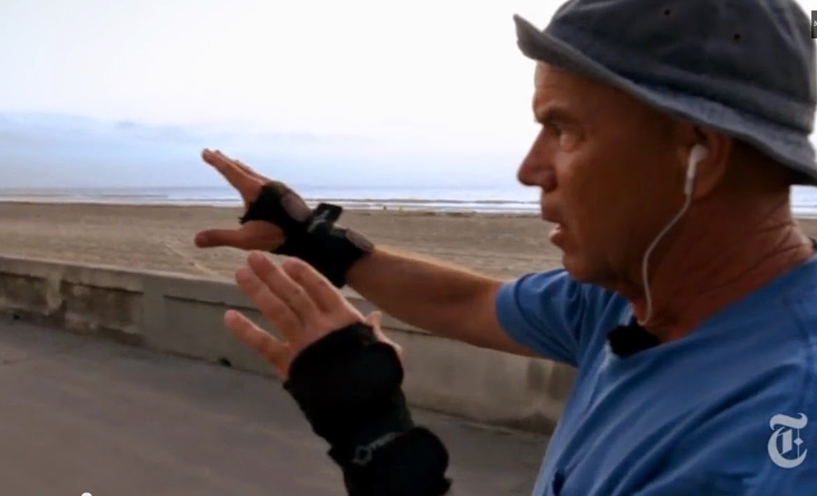
(sorry about the commercials on YouTube)
Now to relate this video to me.
A professional artist (meaning one who makes his/her living from their art) as seen from the outside appears to be the embodiment of freedom and liberation. A causal day where you follow your creative spirit and then have wine and chess at the end of the day as you watch the sunset.
A professional artist (meaning one who makes his/her living from their art) as seen from the outside appears to be the embodiment of freedom and liberation. A causal day where you follow your creative spirit and then have wine and chess at the end of the day as you watch the sunset.
Now for a dose of reality, it's nothing like that, that's an illusion...a fairy tale. I'm not one to shy away from hard work and I certainly understand that to make a success of yourself, especially in the arts, you have to work very, very hard and wear many hats. Exactly what I've done in my career. I did what I though I was suppose to do. But somewhere along the way, in the daily fray of battle, I lost "me" my art spirit seems to have taken a holiday without me knowing it, and I don't know where it's gone.
I'm sorry, if you're waiting for a profound answer at this post, I have none, it's simply a question. It's where I find myself these days. Perhaps an answer will come someday, or maybe not, and I'll head off to go skating and I'll leave the rat race that is the contemporary art scene of today behind.
"Keep the cheese, I just want out of the trap"
Monday, March 9, 2015
Class Portrait Demo: Shapes and simplification
Short demo for my class at Salt Lake Community College

1 hr. to this stage.
I made slow progress because I talked through what I was doing, along with answering questions. The main idea I wanted to impart to the students was to simplify. It's not the details that make a likeness, it's the big shapes.
"My palette was very basic: titanium white, ivory black, cad. yellow lt., cad red lt., perylene red, ultramarine blue, yellow ochre, burnt sienna and raw umber.
I made slow progress because I talked through what I was doing, along with answering questions. The main idea I wanted to impart to the students was to simplify. It's not the details that make a likeness, it's the big shapes.
"My palette was very basic: titanium white, ivory black, cad. yellow lt., cad red lt., perylene red, ultramarine blue, yellow ochre, burnt sienna and raw umber.

Stage 2
I began again after I turned the students loose on their self portraits. At this point I was able to concentrate a bit better as I didn't have to talk. I took a few minutes to redraw and fix some of the proportions and shapes that were off. I paid particular attention to the widths vs the heights and where features lined up on the vertical.
I began again after I turned the students loose on their self portraits. At this point I was able to concentrate a bit better as I didn't have to talk. I took a few minutes to redraw and fix some of the proportions and shapes that were off. I paid particular attention to the widths vs the heights and where features lined up on the vertical.

Stage 3
As you can see my drawing lines are still on the face. I knew I didn't have enough time to get into working on the face, so I spent the time working the surrounding areas. I took a photo of the model and figured I would have to work from that if I want to finish it. The camera image will give me the shape information and my painting as it is will give me the color and value information. I believe I spent about 2 hours total. I'll try to find some time to finish this portrait from the photo and then I'll post another image.
Tuesday, February 10, 2015
Art 101 -Simultaneous Contrast in Black & White
Colors and values side by side interact with one another and change our
perception. This interaction is called simultaneous contrast.
From the Merriam-Webster dictionary "The tendency of a color to induce its opposite in hue, value and intensity upon an adjacent color and be mutually affected in return--By the law of simultaneous contrast a light, dull red will make an adjacent dark, bright yellow seem darker, brighter and greener; in turn, the former will appear lighter, duller and bluer".
This is an exercise I have my students do every semester. It's quite simple yet fun. We start with the value example below and later in the semester we do it in color.
Exercise: Paint 3 small rectangles of a medium grey all the same value. Below the 3 are marked A, B, C. They are the same value--they really are. Then simply paint around each rectangle with white, a slightly darker grey and then black and viola- simultaneous contrast in it's most simple form. As you can see the 3 small rectangles of grey appear as very different values. Give it a try. I'll show you some color examples in a later post.

From the Merriam-Webster dictionary "The tendency of a color to induce its opposite in hue, value and intensity upon an adjacent color and be mutually affected in return--By the law of simultaneous contrast a light, dull red will make an adjacent dark, bright yellow seem darker, brighter and greener; in turn, the former will appear lighter, duller and bluer".
This is an exercise I have my students do every semester. It's quite simple yet fun. We start with the value example below and later in the semester we do it in color.
Exercise: Paint 3 small rectangles of a medium grey all the same value. Below the 3 are marked A, B, C. They are the same value--they really are. Then simply paint around each rectangle with white, a slightly darker grey and then black and viola- simultaneous contrast in it's most simple form. As you can see the 3 small rectangles of grey appear as very different values. Give it a try. I'll show you some color examples in a later post.
Wednesday, February 4, 2015
Art 101 -2 value head study B&W no blending
This is a great exercise for any beginning artist. Actually, it's a good idea for any artist to come back to this once in a while to help you remember what's important and to help you to keep things simple.
I always tell my students that it's not the details that define a likeness-it's the shapes. Look at the B&W, simplified image below--do you know who that is? Well if you're familiar with the personality there's no doubt that you recognized Jimi Hendrix immediately. Why? It's the shapes! Not just the face, but also the hair and the proportions of hair to face.
I teach at a local community college and I have my students do this every semester. It's a great lesson and one of my favorites. If you want to try this at home, you can print out the image below and copy it. I don't mean copy, as in trace it, but rather draw it as accurately as you can with charcoal or pencil. Take your time and get it right. In class we usually make our paintings 16 x 12 because this gives you enough room to work into the small areas of the face. After you've drawn it out, it's kind of like paint- by-numbers. Remember, it's the Montagues and Capulets. They don't like each other, so no blending. Use black paint in the black areas and white paint in the white areas. Lay it down thick and with a little medium to help the paint flow. I find using two brushes works best.


Choose an image that is not too complicated, something like the example of the Jimi Hendrix head above. In your choice of image editing programs, turn the image first to grey scale then to 2 values (I believe a posterize filter works but I think there are several ways to do this). Then you should be able to either print it out or just paint it from your computer monitor.
This exercise helps you see simple shapes which allows you to simplify and clarify your work. It also helps with your drawing ability. Simple, large shapes are a huge part of drawing.
Good Luck!
I always tell my students that it's not the details that define a likeness-it's the shapes. Look at the B&W, simplified image below--do you know who that is? Well if you're familiar with the personality there's no doubt that you recognized Jimi Hendrix immediately. Why? It's the shapes! Not just the face, but also the hair and the proportions of hair to face.
I teach at a local community college and I have my students do this every semester. It's a great lesson and one of my favorites. If you want to try this at home, you can print out the image below and copy it. I don't mean copy, as in trace it, but rather draw it as accurately as you can with charcoal or pencil. Take your time and get it right. In class we usually make our paintings 16 x 12 because this gives you enough room to work into the small areas of the face. After you've drawn it out, it's kind of like paint- by-numbers. Remember, it's the Montagues and Capulets. They don't like each other, so no blending. Use black paint in the black areas and white paint in the white areas. Lay it down thick and with a little medium to help the paint flow. I find using two brushes works best.
(Photo and digitized credits unknown)
The original image that the two-value image is based on.
(Photo credit unknown Jimi Hendrix)
Now, if you want to use your own image for this same lesson, here are a few instructions:
Choose an image that is not too complicated, something like the example of the Jimi Hendrix head above. In your choice of image editing programs, turn the image first to grey scale then to 2 values (I believe a posterize filter works but I think there are several ways to do this). Then you should be able to either print it out or just paint it from your computer monitor.
This exercise helps you see simple shapes which allows you to simplify and clarify your work. It also helps with your drawing ability. Simple, large shapes are a huge part of drawing.
Good Luck!
Friday, April 18, 2014
Making lots of starts.
"Put off finish as it takes a lifetime - wait until later to try to finish things - make a lot of starts." ~Charles Hawthorne

Demo about simple shapes from my resent Scottsdale Artists' School workshop.
Many times I don't get very far in my demos during workshops,
as I always encourage dialog between myself and my students.
___
One of the main ideas I teach in my workshops is not to be concerned with finishing any of the studies we do. It is in these little studies of the art principles that we as artists learn and grow. By doing these exercises it helps to break us out of habits that we have developed over many years which can cloud our vision.
I thought I would share a resent email I sent to a student interested in taking one of my upcoming workshops.
My response:
First off, I very much appreciate your comments and questions.
When I first set up my curriculum for workshops I decided to approach it from two different directions. The first is to insure that the students understand the basic elements of painting/art via short studies focusing on single elements--example the limited palette. This is by far the best way for artists (including myself) to learn and grow. The second is to allow students more time to work on one piece/pose, so they may take something home that gives them a sense of accomplishment--a more finished piece.
That being said, I have found that the students learn so much more through the shorter studies that I have found myself reducing the time spent on the longer paintings. I have always said, I would rather students take home knowledge than product. This knowledge always finds its way into our work and leads to faster improvement. I do encourage students to take photos of the model as we go, and so when the students get home they can use the studies and the photos in combination to make a larger, more complete painting.
As for the longer pose, I have to be flexible in workshops because of the model's availability. Sometimes we can't get the same model for the entire day. So I approach the longer sessions in one of two ways. Either one long pose on the last day (morning/afternoon) or splitting the long poses up in two or more afternoon slots. One advantage of this approach is it allows me to teach my methods of working back into a dry painting.
Hope this helps.
Thanks,
Bryce
Upcoming workshops:
Fredericksburg Artists' School
May 5-9 2014
830.997.0515
http://www.fbgartschool.com/
-
Whidbey Island Fine Art Studio
July 21-25 2014
360.637.4690 / 206.571.0442
http://www.whidbeyislandfas.com/
Fredericksburg Artists' School
May 5-9 2014
830.997.0515
http://www.fbgartschool.com/
-
Whidbey Island Fine Art Studio
July 21-25 2014
360.637.4690 / 206.571.0442
http://www.whidbeyislandfas.com/
Sunday, April 13, 2014
Painting Demo at Scottsdale Artist's School


Getting a likeness with no features
This is a demo I did during my week long workshop at the Scottsdale Artists' School, April, 2014.
As you can see I didn't get very far, but believe it or not I accomplished my goal. The main principle I wanted to impart was that features are not really what makes a portrait look like a specific person--it's the big shapes. During the week, this study was seen by many people and everyone who saw it knew instantly who the model was.
Students: So think about that the next time you're painting a face. Try to paint it with no features then step back and ask yourself if it looks like the person you're painting.
"...If you work on a head for a week
without indicating the features you will have learnt
something about the modeling of the head." --J.S. Sargent
without indicating the features you will have learnt
something about the modeling of the head." --J.S. Sargent
My second goal was to work with temperature to turn the form because there was a very tight value range in the face. Meaning, other than the darks in the eyes and hair and the highlights on the skin there were only two values. So that gave me a lot of room to play with color variations that were in the same value range. Sorry the photo really doesn't show those little variations- it's a bit blurry.
The other major principle I discussed during this demo were edges and how powerful they can be in drawing the viewer's eye to the center of interest.
Monday, February 24, 2014
Upcoming Workshops
~Workshops for 2014~

~Scottsdale Artist School~
March 31st - April 4th
3720 North Marshall Way
Scottsdale, AZ 85251
(480) 990-1422 / (800) 333-5707
http://www.scottsdaleartschool.org/
~Sign up page~
-
~Fredericksburg Artists' School~
May 5-9 2014503 E. Schubert
Fredericksburg, Texas 78624
830.997.0515
http://www.fbgartschool.com/
-
~Whidbey Island Fine Art Studio~
July 21-25 2014
813 Edgecliff Drive
Langley, Washington 98260
360.637.4690 / 206.571.0442
http://www.whidbeyislandfas.com/
-
~Course Gallery and Atelier~
October 10th - 13th 2014
4144 Herschel St.
Jacksonville, FL 32210
(904) 388-8205
Toll Free (877) 386-8205
http://www.corsegalleryatelier.com/
March 31st - April 4th
3720 North Marshall Way
Scottsdale, AZ 85251
(480) 990-1422 / (800) 333-5707
http://www.scottsdaleartschool.org/
~Sign up page~
-
~Fredericksburg Artists' School~
May 5-9 2014503 E. Schubert
Fredericksburg, Texas 78624
830.997.0515
http://www.fbgartschool.com/
-
~Whidbey Island Fine Art Studio~
July 21-25 2014
813 Edgecliff Drive
Langley, Washington 98260
360.637.4690 / 206.571.0442
http://www.whidbeyislandfas.com/
-
~Course Gallery and Atelier~
October 10th - 13th 2014
4144 Herschel St.
Jacksonville, FL 32210
(904) 388-8205
Toll Free (877) 386-8205
http://www.corsegalleryatelier.com/
Wednesday, February 12, 2014
Materials and Components: Flake White- a little knowledge goes a long way?
Is painting with lead white worth it? Is it so dangerous that we artists shouldn't use it?
I often hear students and artists propagating exaggerated and untrue
information about this indispensable pigment. I feel compelled to clarify some
of the misconceptions and even paranoia about one of the greatest pigments for artists of all time! With just a few simple precautions everyone can learn to enjoy the unique properties of lead white.
Before we begin, let me ask you a question.
Do you think Sargent used titanium white to paint this sumptuous portrait?

How about Rembrandt?

Bouguereau?

Sorolla?

How about Waterhouse?

The answer to all of the above is NO!
They used flake white, cremnitz white or perhaps flemish white.Yes folks, those are all lead whites.
Let me throw out a few other names that used lead white as their white: Velasquez, Vermeer, Rubens, Titan, Caravaggio, Reynolds, Repin, Courbet, Zorn, Fechin, Inness...the list is endless. In fact lead white has been used for thousands of years and its history goes back to ancient Greece and Rome.
Now don't get me wrong, titanium white is a fantastic pigment, and is a perfectly good white to use for many artists in many situations. I simply want to point out some of the unique properties of lead white.
Now don't get me wrong, titanium white is a fantastic pigment, and is a perfectly good white to use for many artists in many situations. I simply want to point out some of the unique properties of lead white.
Note: In this article I will just use the generic term lead white to describe artist pigments such as flake
white, cremnitz white, flemish white and a few other not so common
names. The base pigment used in all these paints is either basic lead carbonate PW1
or lead sulfide PW3 (in flemish white). Typically cremnitz white is PW1, and flake white is PW1 mixed with some PW4(zinc oxide). I've noticed companies will change that around sometimes and in some cases will even add titanium PW6 to their flake white. I'm sorry it has to be so confusing.
Second Note: Most titanium whites are mixed with PW4 (zinc oxide). In my opinion this is the only usable titanium. Titanium by itself is best used for painting your house.
_____________________________
First
off let me talk about the handling properties of lead white vs titanium
white.
1-Titanium
white is a very strong white with a high tinting strength.Coupled with its opaqueness it can over take many of the other colors you have on
your palette. For example, have
you ever painted a face (or other objects for that matter) and stepped back to realize it's all too chalky?
What happened? Well, there are many reasons for this but the overpowering strength and opaqueness of titanium white cannot be over- looked.
2-Lead white, on the other hand, is semi-opaque and the pigment tinting strength is lower. In fact, because of the lower tinting strength you don't have to use as much of your other colors for your mixtures, especially those very expensive cadmiums and cobalts. When using lead white I find it much easier to change the color temperatures in my paint mixtures without changing the values. I also find it easier to bulk up my paint layers simply because I'm using more of the lead white in my mixtures.
2-Lead white, on the other hand, is semi-opaque and the pigment tinting strength is lower. In fact, because of the lower tinting strength you don't have to use as much of your other colors for your mixtures, especially those very expensive cadmiums and cobalts. When using lead white I find it much easier to change the color temperatures in my paint mixtures without changing the values. I also find it easier to bulk up my paint layers simply because I'm using more of the lead white in my mixtures.
3-Lead white is a warmer white than titanium. This warm softness of tone lends itself beautifully to painting flesh tones. It also has a soft creamy, yet stiff consistency which I love. It's sorta like painting with butter and it retains brush strokes easily. Works great for those impasto areas.
Note: I need to point out that flemish white PW3 has a different handling characteristic to flake PW1,PW4 or cremnitz white PW1, in that it has a long ropey consistency (kind of stringy) and has a leveling effect, meaning your brush strokes will tend to level off and lose their brush marks. It takes a little getting use to.
4- Lead white dries faster than titanium, which might be a good characteristic for you plein air painters.
5- Lead white has a lower oil absorption than titanium white. Which means it takes less oil to make it into an oil paint. This makes it a fantastic paint for anyone doing layers or under-painting. It fits the fat over lean rule of painting.
________
Now let me address the toxic aspects of the lead pigments. First off I want to point out there are really only three ways that lead might be introduced into your system as an artist.
1. Inhalation (you breathe it in)
2. Skin absorption
3. Through your mouth, tongue, eyes and nose.
1. Inhalation: lead white is in it's most dangerous state as a dry pigment. It becomes easily inhaled into the lungs and introduced directly into the blood stream. Bad! But let me ask all the artists out there, do you use lead white dry pigment? Some do, but the vast majority do not. We use it in a premixed tube of paint. One other way it might be inhaled is through sanding. That is, sanding down the surface of your dry painting. But regardless of what pigments you've used, it would make sense to take all precautions available when doing this. There are several pigments I wouldn't want to inhale such as all the cadmiums, cobalts, cerulean and a few others. So lead white is no different.
2. Absorption through the skin: This is not generally true. The lead pigment particle is actually quite large and is not readily able to be absorbed directly through healthy skin. However, If you have open sores and cracks on your hands it would allow the particles to get down through your skin. Again, Bad! But a simple solution for that is to wear gloves. Besides, gloves aren't a bad idea in general, I use them just to make clean up easier.
3. In through your mouth, eyes and nose: Okay, my rule-- DON'T eat while painting. Don't smoke while painting, (well there's a myriad of unhealthy things going on there, maybe just don't smoke PERIOD!). And basically just be aware of where your hands and your brushes are going. I mean not in your mouth! Just simply keep your face out of the painting process. Not too hard right?! Nicoli Fechin's liberal use of his saliva in his paint led to lead poisoning and I believe it killed him. This is also the primary cause of children getting lead poisoning from flaking exterior paint on old buildings. The old (apparently sweet tasting)dry paint flakes off and falls in the soil. The children play in the dirt and as all children do, they put the dirt and things that have been in the dirt, in their mouths. Voila--lead poisoning. And we all know young children are particularly susceptible to the effects of lead. Anyway I digress. After you're done painting, simply wash your hands. Then go get that snack you've been craving.
___________________
So bottom line, yes it is toxic, but I really think a little
knowledge goes a long way and always supersedes any form of ignorance or paranoia. As a painter it's your responsibility to know
about all of the components you're using and how they work together. Being a
painter means you're also a chemist! Always look to see what pigments are in your tubes of paint regardless of the color. If they don't state what they're made of, don't buy them.
I highly recommend a book every artists should have at his/her disposal:
The Painters Handbook by Mark David Gottsegan
I highly recommend a book every artists should have at his/her disposal:
The Painters Handbook by Mark David Gottsegan
There is just so much to discuss about white that I couldn't get to all of it here. But remember, white is the most important
color we artists use. It goes into nearly every mixture we make.
_____
I've included a few links below to companies that still make lead white. I believe all the major art paint manufacturers have stopped production entirely.
_____
I've included a few links below to companies that still make lead white. I believe all the major art paint manufacturers have stopped production entirely.
Michael Harding
This site is a great resource regarding pigments and their corresponding chemical names.
Color of Art Pigment Database
This site is a great resource regarding pigments and their corresponding chemical names.
Color of Art Pigment Database
If you'd like to know more about lead white, I discuss it in more depth in my workshops. And remember if we, as artists, allow lead white to be villianized, are cadmiums next? How about cobalts or cerulean? In all of these cases there is no suitable replacement. We are allowing our hands to be tied.
My Upcoming Workshops:
Thursday, July 11, 2013
My Perseptions #3 The Limited Palette

Colors used:
Titanium white -Utrecht
Yellow ochre - Rembrandt
cad red medium - Rembrandt
Ivory black - Gamblin
It's back! Yes it's the old limited palette.
In my workshops we spend a lot of time working with the limited palette. Not just these particular colors.
Again I want to stress it's about relationships, everything is relative to each other. Sure the green you get is pretty dull but so is the violet. When you get them working next to each other, they really stand out. It's a bit like the old saying you dont get lights without darks.
"A sketch has charm because of its truth – not because it is unfinished."
-Charles Hawthorne
It's back! Yes it's the old limited palette.
In my workshops we spend a lot of time working with the limited palette. Not just these particular colors.
Again I want to stress it's about relationships, everything is relative to each other. Sure the green you get is pretty dull but so is the violet. When you get them working next to each other, they really stand out. It's a bit like the old saying you dont get lights without darks.
"A sketch has charm because of its truth – not because it is unfinished."
-Charles Hawthorne
Tuesday, June 11, 2013
The Good, the Bad and the Ugly #2
Referring to my sketches of course, not the models: They're full of mistakes--but hey, they are what they are!!
__
 |
| 9 x 6 life study- 30 min. This was an interesting little study. It's sorta free form, that is, I did no pre-drawing and really just turned off my brain. I remember feeling relaxed when I walked into the open drawing session. I really had no expectations whatsoever. No pressure is always a good thing! |
 |
| 10 x 8 life sketch- 1 1/2hr. I wanted to experiment with atmosphere with this little study. I used a palette knife to keep pulling the paint layers down. I would then repaint certain areas. This is a more indirect approach to painting. Many times you have to go backwards before you can go forward. |
 |
| 16 x 12 (sketch from photo reference) 1 1/2hrs. I did this little study on a day where I scraped off the painting I was working on for one of my galleries. And instead of leaving the studio in shame, I decided to pull out an old photo and play around. I was quite pleased how this one came out. |
Great patience is called for on the hard path that I have entered on.
-Edgar Degas
Wednesday, May 29, 2013
My Perseptions #2 Form, Edge and Shape
Personal thoughts about a painting fresh off my easel.
 |
| Lotus 16 x 20 Oil on Linen |
This is not a step by step instructional post, but rather an attempt to put into words some of the thoughts going through my head as I worked on this painting.
My full palette:
ivory black, raw umber, transparent oxide red, Sevres blue, ultramarine blue, dark cool red* , cad red
light, cad orange, cad yellow lt. titanium/zinc white.
*my deep cool red is made up of two colors -quinacridone violet, peylene red.
*my deep cool red is made up of two colors -quinacridone violet, peylene red.
___
I need to make one disclaimer here before I go on: in this image of the painting (as with all my images) I don't feel the camera captured the subtle changes of temperature and values of the flesh and I always find my images have too much contrast. Even though I'm pretty versed in image manipulation, the images never portray the beautiful subtitles of the original painting. But that's why we buy original art right!?:-)
OK, so now I have that off my chest, let's move on. When the model struck this pose I knew I had something. I love the simple lines, the simple overall shape. I enjoy the separation between the lights and the shadows. Notice the warm reflection bouncing up from the upper thigh onto the ribcage. The pose really seemed to me to have a lot of emotion and more than enough beauty.
I found the drawing aspect to be easier than most--no hands, no face. But I must say that drawing is always a challenge for me. But it's really just a circle--right? That's what I based it on and then just divided up the big shapes. My next challenge was to turn the form across the back and get a feeling of the light falling down upon the figure. I subdued the light on the lower leg and brought up the highlight on the hip--which is the center of interest.
Currently edge is one of the elements of art that I want to take to the next level. So I had some fun letting go and scraping down and blurring the edges. It seemed to help set the figure into the surrounding environment properly. Atmosphere is the other element that I'm working on extra hard these days--we'll save that for another post.
To finish off the painting I ran out to my lily pond to pick some lotus blossoms...no just kidding I dont have a lily pond. Okay I confess they're just some silk ones I have in the studio.
The whole painting took almost 3 days to complete using a life model and finishing it from photos.
____
Remember to pay close attention to any object’s inherent shape and try to keep it simple. Think circles, rectangles and triangles. Also, try not to think of what a specific object is, instead think, “What shape is it?” Remember, shapes play an extremely important role when it comes to working with the figure. An arm is not an arm, but a cylinder. Finally, be sure to give shapes a little variety and at the same time pay attention to the negative spaces—which are shapes too.
"If the artist sees nothing within him, then he should also refrain from painting what he sees before him."
-Caspar David Friedrich
Monday, December 10, 2012
Perseptions
Perceptions
on
Color relevancy and the limited palette

2 hour study from life--Limited palette.
Colors used:
Titanium white -Utrecht
Yellow ochre - Rembrandt
ced red medium - Rembrandt
Ivory black - Gamblin
I find December a great time to step back and rethink a few things. The first order of business was to scrape down my palette. I wanted to reset my thinking on color. So I decided to give the "Zorn" colors a try again. I have worked with this set of colors at different times over the past ten years. So I was excited to give 'em a try again.
When you have the model in front of you and the clock is ticking, there's a lot going through your mind. One of your comfort zones is to grab for your "typical colors" the ones you're use to and start mixing. But what happens when they're not there...and the clock is ticking! You have to rethink everything and fast!
But just relax and remember, values are king, so dont throw the baby out with the bath water here. And just keep thinking and observing warm and cool...and of course don't forget to squint. Simple right? It's simpler than you think and exciting. Don't think about trying to get "that" color you see. Instead ask yourself
what temperature and value is that color relative to everything around
it, and mix according to that rule. You'll be surprised by what you can
do with so little. I'll stick with this limited palette for a while, I really enjoyed it.
So next time you paint, give it a try and let me know how it goes.
So next time you paint, give it a try and let me know how it goes.
Final thought--it's all
about relevancy.
"Only when he no longer knows what he is doing does the painter do good things." --Edgar Degas
Wednesday, November 14, 2012
The good, the bad and the ugly #1
I call them- The good, the bad and the
ugly. Referring to my sketches of course, not the models. They're full
of mistakes--but hey, they are what they are!!!
________

15
minute- On gessoed drawing paper- 7x10. Focus: I wasn't too concerned
with proper proportion or detail, I was only after the gesture.
Surprising how the eye can fill in the missing parts.

10
to 15 min- Hahnemuhle drawing paper coated with acrylic medium to seal
the paper from the oil- each is 7x5. Focus: These are fast and fun to
do. You only have time to get the basic shapes--dont forget to squint!

1
hour- On Centurion linen- 10x8. Focus: I was after shapes and
proportions without an preliminary drawing. Train you eye to see proper
shapes.

1
hour- On gessoed drawing paper- 10x 6 Focus: I simply wanted to see how
far I could push color. Values are the foundation for the structure.

1
hour- On gessoed drawing paper- 14x11. Focus: With this quick portrait I
was after a tonal feel, so I limited the color and kept the paint thin.

45
min- On Centurion linen- 8x10. Focus: I was after the simple separation
of light and shadow. I had some fun putting down very thick paint on
the light side.

45 min- On Centurion linen- 8x10. Focus: Sometimes we just dont have time to finish--it is what it is..no see, no hear:-)
Subscribe to:
Posts (Atom)